Article Text

Abstract
Research is of little use if its results are not effectively communicated. Data visualised in graphs (and tables) are key components in any scientific report, but their design leaves much to be desired. This viewpoint focuses on graph design, following two general principles: clear vision and clear understanding. Clear vision is achieved by maximising the signal to noise ratio. In a graph, the signal is the data in the form of symbols, lines or other graphic elements, and the noise is the support structure necessary to interpret the data. Clear understanding is achieved when the story in the data is told effectively, through organisation of the data and use of text. These principles are illustrated by original and improved graphs from recent publications, completed by tutorial material online (appendices, web pages and film clips). The popular matrix form (multiple graphs in one frame) is discussed as a special case. Differences between publication (including the proofing stage) and presentation are outlined. Suggestions are made for better peer review and processing of graphs in the publication stage.
- epidemiology
- outcomes research
- economic evaluations
- health services research
- treatment
Statistics from Altmetric.com
Effective communication of scientific data is arguably one of the most important skills of a scientist. If the intended audience does not get the message in the data (and acts on it), the research effort is wasted. The audience must first be drawn in by a concise and attractive title, a carefully written abstract and key messages. People will stay interested if choices between body text, tables and graphs have been optimised for audience and setting. Data visualisation in tables and graphs can convey complex relationships in a way unmatched by simple text, but wrong choices can lead to misinterpretation and wrong decisions.1
Despite the above, communication has traditionally received short thrift in scientific education, and it is not really stimulated by journals, scientific societies and so on responsible for dissemination of research. PhD programmes offer writing tutorage mostly focused on body text; journal instructions rarely go beyond specifying the maximum number of tables and figures.2 At conferences, guidance is mostly limited to the time allowed for oral presentations and the size of posters. On submission, resolution of figures is routinely downgraded in the package accessible to reviewers. It is therefore not surprising that the quality of data visualisation is at best mediocre. A review of articles submitted to BMJ concluded that less than half of the tables and figures met their data-presentation potential.3 Also, external peer reviewers and editors rarely commented on tables or figures.
For Annals of Rheumatic Diseases (ARD) and other journals, I have been working over the years to improve quality through better guidance, including brief tutorial videos.4 5 Recently, I published an article on effective table design in Heart, like ARD a journal in the ‘BMJ family’6; this is a companion article that focuses on graphs. Both articles expand on the guidelines for authors.4 Content is mostly based on sound design principles and tradition, informed by the science of human visual perception. There is little empirical evidence to support specific recommendations, so there is room for experimentation and innovation to see what works best. My own experience in data visualisation has been greatly inspired by three sources: Tufte, Cleveland and Few.7–9
Methods
For this Viewpoint, I searched recent issues of ARD to find standard graph examples of at least adequate quality as published.10–12 I reconstructed the datasets by copying each graph image to the program GraphClick for Mac (Arizona software, V.3.0.2) and extracting the data points by hand. I imported the resulting dataset into Excel for Mac 2016 (Microsoft, V.16.10) to achieve the proper ordering and coding, and subsequently into Prism for Mac (GraphPad software, V.7.0d) that helped me design all graphs, including the journal Impact Factor graphs designed specifically for this Viewpoint. For the distribution graphs, I used the dataset and an existing graph from a recent meta-analysis.13 Available as online appendices are the annotated Prism files (online supplementary appendices 1 and 2) (can only be opened by the Prism program) and preference settings I use (online supplementary appendix 3), a spreadsheet file to help calculate the ‘null zone’ (online supplementary appendix 4, explained in the caption to figure 4), a checklist with common issues in table and graph design (online supplementary appendix 5), and additional examples (online supplementary appendices 6 and 7).
Supplementary file 1
Supplementary file 2
Supplementary file 3
Supplementary file 4
Supplementary file 5
General design principles
At the start of the design process, key questions to ask are four ‘W’s: Who is the audience? What are my messages (to this audience)? Which messages need visualisation in a table or graph? What would be the most effective form for each? Graphs are best to convey large amounts of information and to allow pattern recognition, whereas tables are best to display a limited amount of information with precision and simple relationships between variables.
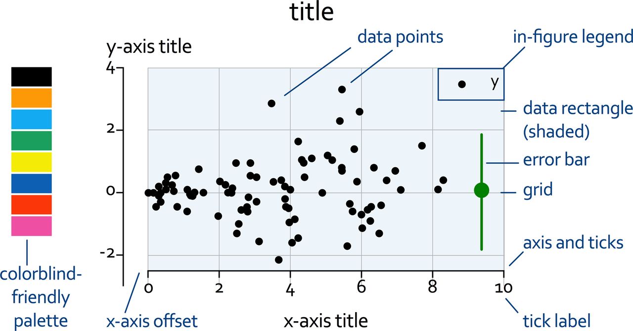
Two design principles can be distinguished: clear vision and clear understanding. Clear vision is about maximising the signal to noise ratio in the visualisation. The signal is the data ‘ink’, that is, all pixels in a graph that depict or represent data. The noise (‘non-data ink’) is all of the supporting elements: axes, titles, labels, legends, and so on (figure 1).14 Clear understanding is about telling the story in the data. This involves organising the data and optimising the use of text.

Graph nomenclature. This example shows most of the common elements that can be found on a graph. Apart from the data points and the error bar, all other elements are ‘non-data ink’ that may or may not be necessary. On the left, a colourblind-friendly colour palette is added. This current text is called the ‘caption’.
Which software?
A practical issue is the choice of software. Standard spreadsheet, presentation and statistical packages readily produce graphs of varying complexity, but optimisation for presentation or publication is a great challenge. Fortunately, there are now many dedicated graphing packages available that can fill the need. I have most experience with Prism and Deltagraph (Red Rock Software), but there are many more. For me, a key characteristic to choose between them is the availability to edit each separate graph component. The added learning curve is more than offset by the frustration avoided.
What graph?
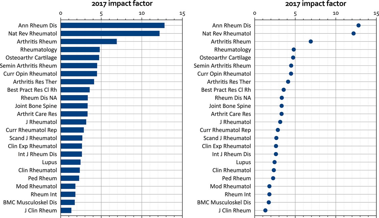
Main purposes of scientific graphs are to describe: labelled measurements, time series, relations between two or more variables, distributions and statistical variation. Almost all of these can be captured by dot and bar plots (figure 2), step and line plots (figure 3 and figure 4), scattergrams (figure 5), histograms (not shown), box plots and combinations of these in matrix plots (figure 6). Each figure shows an example with suggestions for improvement discussed in more detail below. Bar plots are popular, but in most cases are best replaced by dot plots for labelled observations (figure 2) and scatter plots for distributions (figure 6). The following graph types are best avoided completely because they are less effective, prone to bias or both: pie, stacked bar, area, radar (spyder) and three dimensional.9 15 16 Various new types of graphs have been developed to fit specific needs, but these fall outside of the scope of this Viewpoint.

Labelled measurements. Impact factors of rheumatology journals in 2017, as bar (left) and dot plot (right), ranked by impact factor. A thin grid and repeated ticks allow exact reading. I prefer the dot plot because it communicates the same data with much less ‘ink’. Bars are probably better for physical quantities, where the suggestion of real mass or volume must be conveyed.

Survival curve (step plot). The original on the left10 clearly depicts the data series. However, it has suboptimal resolution (grainy, fuzzy, artefacts on magnification) and a lot of text inside the data rectangle. In the suggested improvement on the right, the physical size is reduced: one column width and smaller vertically. Signal improvement: series lines made slightly more prominent. Noise reduction: axes and ticks thinner, y-axis title shortened and placed upright, number of x-axis tick labels reduced and number of patients at risk placed as a separate step plot under the main curve. ‘Story’ improvement: thin reference line placed at 50% in both curves; deleted text information (HR, p and also the in-figure legend) to be placed in the caption.

Line plot. The original at the top11 depicts a common placebo-controlled trial design where both groups are switched to open-label active drug after a certain period. It clearly shows two data series, slightly staggered to prevent overlap, with change suggested at week 48 through a change of colour of the series, background shading, a label and arrows. The original figure also had a summary data table attached below (not shown here). The improved graph is shown with the same physical vertical size, but it could probably be shrunk to fit into one column. Signal improvement: as the treatment of the active group does not change, except for switch to open-label, this group is best depicted as one data series. To ‘tell the story’, I have used colour (blue for active and orange for placebo) for the series and carried this through to all the text labels and the shading. Also, the y-axis scale now better agrees with the uncertainty in the data. Further signal improvements: series lines are prominently thick and continuous; the thin error bars are double-tiered and show both the SD and the 95% CI of the mean (horizontal ‘whiskers’) on only one side of the mean, and I have added the ‘null zone’ that depicts the area in which the two means fall if the difference between them is not significant at the 5% level.17 Noise reduction: a thin grid helps orient the eye (even thinner for the minor ticks), replacing the dashed horizontal line; the dashed vertical line and the arrows on top are also rendered superfluous. Supporting text is optimised: y-axis title placed upright as overall title, abbreviations are avoided as much as possible (except for ‘TCZ’, tocilizumab), and the amount of text (tick labels, patients in trial) reduced, but with increased font size. The legend below the figure is no longer necessary, but remaining details (such as the dose) can be included in the caption.

Scatter plot. The original on the left is a so-called ‘Bland-Altman’ plot where differences between two scores (y-axis) are plotted against the mean of the two scores (x-axis).12 Horizontal lines depict the mean difference and its 95% CI, as well as the upper and lower limits of agreement. Although all elements are visible in the original, the resolution is suboptimal and the contrast is very low. The dimensions are suboptimal, falling between one and two columns width. In the improved figure on the right, signal is enhanced by enlarging and filling the data points (fill partially transparent to visualise overlap), offsetting the x-axis to improve visibility of data near zero and shading the areas of interest. Noise reduction: text labels are enlarged and placed upright; the dimensions are improved by shortening the x-axis and deleting the text on the right; this should be placed in the caption.

![[annrheumdis-2018-213396supp003.jpg]](https://ard.bmj.com/content/annrheumdis/77/6/833/DC3/embed/inline-supplementary-material-3.jpg?download=true)
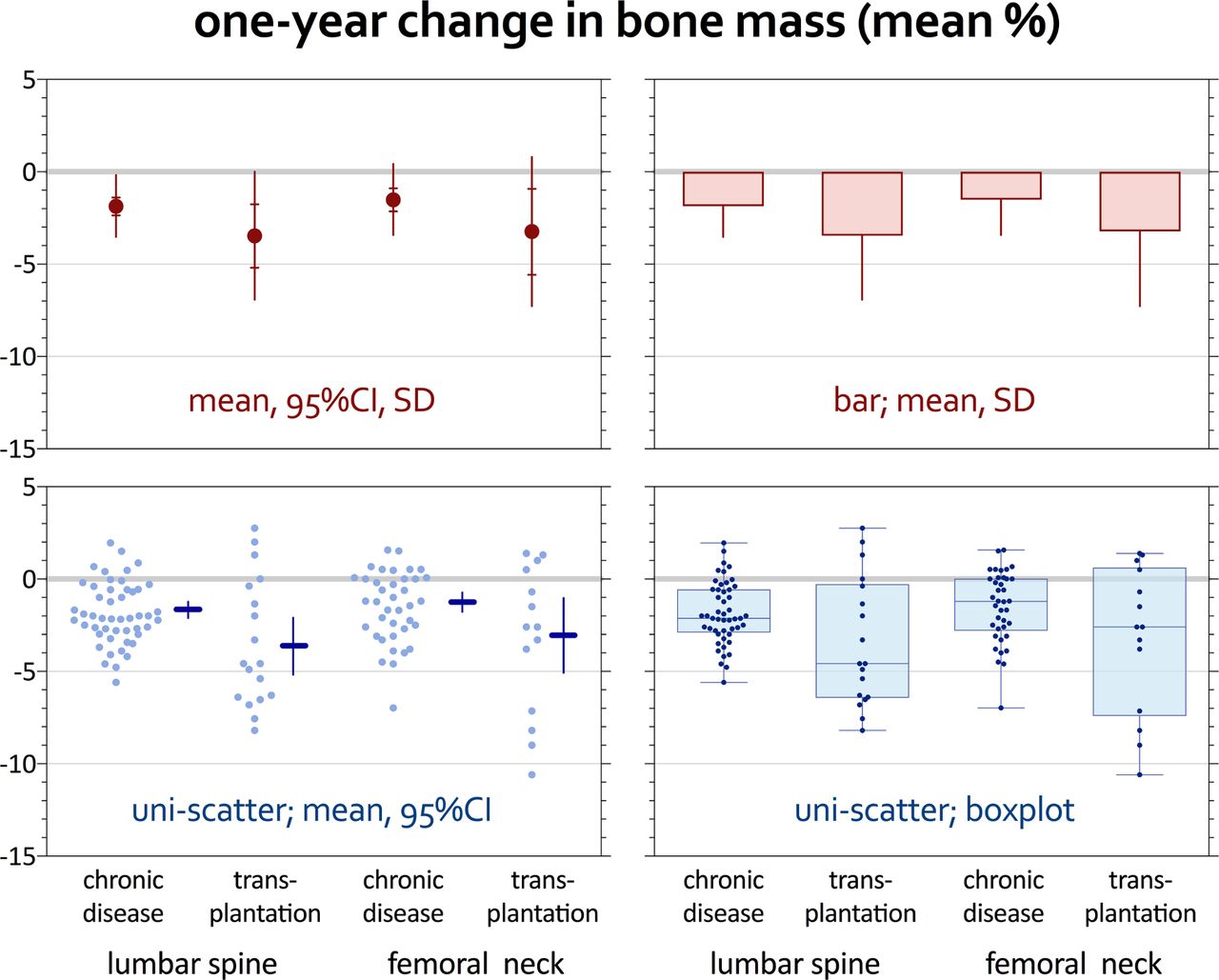
Matrix of distribution plots. The top two panels (in red) show a suboptimal double tier (left) and a poor bar graph representation (right) of a distribution. Double tiers are better than simple error bars, but still only show mean, 95% CI and SD, losing a lot of information. Bars should really be avoided: they only show mean and SD, and give a wrong visual impression of the form and location of the distribution. The improved bottom panels (in blue) show the distribution in a unidimensional scatter plot (individual observations spread out to prevent overlap) combined with a summary. In the left panel (figure as published13), the mean (horizontal line) and 95% CI (vertical line), drawn in by hand; in the right, a box plot designed to show the median, range and percentiles 25 and 75. The box plots are lightly shaded, and the data points are made smaller and darker to create a better balance. The story is enhanced by ordering the categories to bring out the comparison of health condition by anatomical location. For the matrix as a whole, noise is reduced by creating one title/y-axis label on top, printing the x-axis labels only below the bottom panels, unifying the y-axis scale and printing its labels only on the left panels. A thin y-axis main grid is added with a thicker line at zero. Panels are delimited by thin box lines, and tick marks are repeated on the y-axes on both sides to retain visual reference. In this way, the panels can be moved close together and redundant information is avoided as much as possible.
Graph construction
Graphing data should be an iterative, experimental process to optimise clear vision and clear understanding. Clear vision is achieved by highlighting the data. The first step is to minimise the ‘non-data ink’, the supporting elements surrounding the data. All unnecessary items must be avoided or removed, including garish colours and patterns (‘chart junk’), and what is retained must be de-emphasised: axes and ticks must be thin, labels simple, and grids (if truly necessary) thin and light. Then the data ink must be maximised, the data must stand out through the use of visually prominent, non-overlapping symbols and a layout optimised for the final target—publication or presentation. Elements of this process are highlighted in figures 2–6.
Clear understanding means that your graph must tell a story. It goes beyond clear vision and implies choices for the right type of graph, selecting, organising, grouping and sequencing your data, sometimes plotting the same data repeatedly to bring out important relationships, and writing legends and captions that describe and explain clearly. Selecting your data also implies deleting non-essential information, as shown in figures 3 and 4, where summary results and excessive detail on the number of patients threaten to obscure the main message. Other elements of clear understanding are perhaps most clearly shown in the bottom panel of figure 4 where improved colour coding enhances the visibility of the two phases in the trial, so that the legend can be deleted. In figure 4 I have also added the ‘null zone’, an improvement on error bars (see next section): here, it shows no significant difference at any point in the trial.17 Understanding also implies choices in scaling, determining the physical dimensions of the data rectangle, and for matrices, positioning and scaling of the multiple panels and accompanying labels (figure 6). Strategically placed labels and properly formulated captions enforce the message. The caption should explain the elements in the graph and complement the story.
Specific issues
Scale of the axes should be chosen carefully and not be left to the program. I prefer the data to fill as much of the data rectangle as possible. A scale break is mandatory when the range does not include zero, and this works best with scatter plots. Alternatives include application of log scales, or plotting (part of) the data more than once, in separate panels with different scales. In that case, a cool trick is to draw a small reference bar next to each panel that is proportional to the scale used. When x-axis and y-axis have the same unit (eg, in receiver-operator characteristic curve plots), the plot should be square.
Symbols must be carefully chosen for readability, especially when there are many to plot. For difficult cases, characters can also be used as symbols: those best distinguished include ‘S’ and ‘<’. When there are many overlapping points or line segments, extra measures must be taken, such as introducing a small random component in the data, as shown in the unidimensional scatter plots (figure 6), or slightly offsetting overlapping series, as shown in the original of the line plot (figure 4, top panel). Axis offsets can help when data clusters around zero (figure 5). The order in which data series are presented is an important element of design.
Error bars are used to describe statistical variation. As shown in figure 6, these give much less information than unidimensional scatter or box plots. If retained, the error bars should preferably show the SD and perhaps the 95% CI of the mean rather than the SE; both can be shown in a ‘two-tiered’ error bar (figures 4 and 6). Error bars are also used to assess differences between means, but the amount of overlap is difficult to interpret. To solve this, I invented the ‘null zone’, which is the range where means fall if the difference between them is not significant (figure 4; online supplementary appendix 4 for a spreadsheet calculation tool).17
Colour used to be limited to presentations because of cost; now it is becoming mainstream for publications online, and many journals now offer colour printing at reduced cost or free (eg, ARD!). When only the online version is in colour, all graphs should be checked (and if necessary redesigned) so that they will also work well in (greyscale) print. For such cases, I reiterate that patterns (eg, blocks, stripes, hashes, dashes) are relics of printing history: they create ‘noise’ and should be avoided at all cost!
Good colour design is not for the faint-hearted and takes commitment. Most software programs have standard colour palettes that are offensive to the eye, so one must look deeper or go online to find a palette that works well. As colour is readily detected by the visual system, colours can be muted (‘unsaturated’), and the number of different colours should be limited to avoid chart junk. Likewise, ‘graduated fills’—where a colour goes from dark to light in one direction, or one colour changes to another—are rarely a good idea. Finally, most palettes ignore colour blindness. For example, most immunofluorescence micrographs (standard colouring scheme: red–green) are unreadable for colour-blind people. A palette exists that retains colour contrasts for everyone (figure 1). A special website explains the issues in great detail.18
Graphs should be truthful, and apart from the graph types noted above that are particularly prone to bias, improper scaling can often result in incorrect interpretation. For example, in a meta-analysis ‘Forest plot’ that depicts ratios (relative risks or odds ratios), a log scale is appropriate (not a linear scale). Correct labelling becomes even more important when difficult concepts and relationships are being graphed.
Matrix graphs
Matrix graphs are very popular in basic and translational science, where a lot of experiments need to be shown in a limited space or timeframe. These experiments often have an elegant stepwise approach with multiple negative and positive controls in a variety of settings. Unfortunately, the associated graph is often just a collection of suboptimal single graphs shrunk to miniature and placed on a matrix grid. A good matrix is a ‘story of graphs’ that requires meticulous design. An example of a published simple matrix graph and its optimisation is shown in one of the YouTube clips I made for ARD. 5 Clear vision is realised when the framework is predictably constant (through use of common graph types, scales, symbols, labels, etc) and repeating elements are minimised (figure 6). In basic science, generic labelling of series (eg, ‘negative control’, ‘positive control’ or logical abbreviations thereof) are much preferred above specific labels or abbreviations that make no sense outside the specific context. Clear understanding is realised when the ordering of the graphs follows the normal reading direction (left-to-right, top-to-bottom) and the steps described are in the optimum order. In addition, when the underlying process is complicated, graph titles and captions should be informative to help the story along. For example, instead of labelling the panels ‘A’, ‘B’ and so on, they could be labelled ‘normal resting state’, ‘physiologic activation’, ‘activation after blocking pathway X’ and so on. And the caption would not be: ‘figure 1 Summary of activation experiments’, but rather: ‘figure 1 The ABC system in rest, after physiologic activation, and activation after blocking pathways X,Y,Z….’
Publishing and presenting
For publishing, good quality starts with images uploaded in the correct format (‘jpg’, ‘tiff’ or ‘gif’, depending on the journal and your software capabilities) and in high resolution (minimum 300 dots per inch, but 600 or 1200 is better). Graphs should be designed with the typical journal page in mind: two columns on an A4 (or letter size) page. That means a figure will need to fit in one column, across two or fill the whole page. The author has a say in this! The journal production team must see to it that a full-page graph (or table) in landscape mode is rotated to be readable in the downloadable pdf. One can help the staff by placing remarks in the body text, for example, ‘figure 1 about here, suggest to span two columns’. Non-standard sizes (often caused by labels or legends sticking outside the regular frame) will result either in unwanted size reduction or useless whitespace on one or both sides of the figure. One should check the image on screen and on print, also after setting the page size to 25%. This emulates what happens when the image is reduced in size to fit across one column. Many standard software programs have default settings that unacceptably downgrade resolution to limit file size; this also happens when one cuts and pastes images into a word processing document. Portable document format (pdf) is accepted by several journals, but quality on proof is not assured, and strange things can happen to the fonts; so image files are preferable, even though they are much larger. Proofreading is exceptionally important: not only to correct errors, but also to make sure the figures are reproduced as intended; multiple proofs may be necessary. In many cases the technical staff at the journal is less dedicated to the figures than the author. Common issues in the proof stage include resolution loss (even when the figures were submitted in the correct format; see online supplementary appendix 6),17 suboptimal magnification and placement of figures in the text, font substitutions that reduce your symbols and labels to gibberish, partial reproduction (clipped graphs), suboptimal placement of captions and worse. Publishers should be held responsible for an optimal technical process. This includes the production of the figures for the journal web page which is currently completely out of the author’s control.
Supplementary file 6
![[annrheumdis-2018-213396supp006.jpg]](https://ard.bmj.com/content/annrheumdis/77/6/833/DC6/embed/inline-supplementary-material-6.jpg?download=true)
For presenting, there are general guidelines that are outside the remit of this Viewpoint (eg, working with light background and dark letters for data projection, using sans serif fonts, using letter sizes that are large enough to read, etc). Importantly, tables and graphs (usually first designed for publication) should be optimised for presentation, given the much lower resolution and contrast of projection facilities. Graphs taken from publications should be redrawn (see online supplementary appendix 7).19 They may need a redesign in view of the venue, size of the audience, projection facilities and host computer, especially when a (computer) platform switch is necessary. Poster presentation also raises specific issues not covered here.
Supplementary file 7
Peer review
Peer reviewers should demand access to figures (and tables) at optimum resolution, and should study these just as critically as the text. The principles of design apply:
Does this message require a graph (or does another message)?
Is the message best conveyed with this graph?
Is the graph optimal for clear vision, clear understanding?
Is the graph truthful?
The review is more useful when suggestions for improvements are included.
Conclusion
Data visualisation through graphs (and tables) is essential in the scientific communication, but receives too little attention in the preparation (and production!) of scientific reports, publications and presentations. Most common flaws are easily avoided by staying away from suboptimal graph types and following design principles outlined in this article. Authors, editors and publishers should work together to improve data visualisation and stimulate innovation in design.
Footnotes
Handling editor Josef S Smolen
Funding The authors have not declared a specific grant for this research from any funding agency in the public, commercial or not-for-profit sectors.
Competing interests None declared.
Patient consent Not required.
Provenance and peer review Not commissioned; externally peer reviewed.